SquareSpace is a popular online commerce store that is both easy to use and lets you develop beautiful websites quickly. Compared to other platforms like Wix and Shopify, SquareSpace’s interface is much easier for a beginner to manage. It’s a good platform for creative business owners and craft designers to build sites that are beautiful and function elegantly. Your home page of your website is the page that you probably link to most often (although it’s not always the page that your customers land on most often) so it’s important to design a page that works for your audience. In this article you’ll learn how to create a custom home page in SquareSpace that converts to sales. Because, after all, websites are not just about being pretty, but about selling!
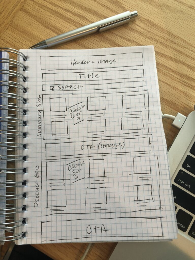
We’ll start not with function but FORM. How the site is designed to guide the user to what you want them to do is as important as the techniques used to design it, so we’ll start with pen and paper, first. Draw out your sections of the site in boxes (I use grid paper, as shown in the example. You’re just drawing boxes – we call this wireframing – and making notes on the specific content you’ll put in those boxes as you build.
Optimizing your home page is about a one-hour task that will yield benefits in increased conversions both for product sales and prospect sign ups.
If you’re not 100% sure you’ll want to replace your existing page, go ahead and create a new page – you can assign it as your home page later (archiving your previous home page for future use.)
Every site should open with a compelling header image with your customer benefit. If you sell sewing patterns, you should tell your customer what they can EXPECT – (not what they are buying) for instance, “make your best-fitting pants ever!” or “make your new favorite jacket, easily!” NOT “we have a new pants pattern!”
If you’re in a membership-driven organization such as an association, try a member benefit “Learn professional development skills to help you advance your career” or “connect with influencers in event management to get that next great position”. You’re selling the RESULT, not the product. Write notes in your header about what products or services you’ll feature. Aim for no more than 5, preferably three.
If your title isn’t in your header already, put it right below the header image.
If you’ve used a composited image with title embedded in the photo as an image, be sure to use a title here so Google can read the header or H1 here to help searchers find your site.
Then, add an internal search bar. This is the #1 most used feature on product-based commerce websites (and it’s a valuable asset to get visitors to their intended content faster.) You can also add the search box to your navigation section if your theme supports it.
Below that, you’re going to insert a product grid, but not a SquareSpace product grid, you’re going to use the Summary Block feature to control layout and functionality much better than a product grid. This is key: choose 3, 6 or 9 products (ideally 6 or 9) in a 3-grid layout. As you customize this block, include the product photo, title and sort by category. We like to add our home page products to a category, but this is also handy for customizing, say, a group of sale items or items within a category later on. It offers you a lot of flexibility to build the grid with the Summary Block feature rather than the product grid tool in SquareSpace.
Now, we’re well beyond the “above the fold” – and in today’s scrollable world, we care less about the scroll than we do getting the right things for your audience to click on. Below the summary grid, put in a call to action. This is what you want your customer to do if they’re NOT buying a product – and typically this is a “get 10% off by signing up” or “download our freebie” type of message here. Big, bold, standout here, try a long skinny call to action button spanning the whole screen.
Below that, you’ll insert a blog grid, again 3×3, to your best content that will entice users who aren’t ready to buy, or are customers looking for more. EACH blog post itself (upon click) will have a specific product attached, and a specific call to action on it. As we move down the page, we either have more engaged or less engaged customers – if they’re ready to buy, they’ll just hit product and go. If they aren’t, they may not be ready, but might read blog posts or convert on an offer.
You’ll finish the home page with another call to action area, typically a follow/share social section with icons “follow us on social”.
Embed a social feed for Instagram. Only feeds can be featured, so make sure you have a well-curated feed of inspiring photos.
Absolutely include a popup – as an exit intent – to ask people to sign up for something (an offer, a discount, a freebie) before they leave your site. You can customize this using 3rdparty tools or built-in ones in SquareSpace.
That’s it! Your brand-new home page is optimized using SquareSpace!
Track your metrics in SquareSpace analytics and see how they improve with your new home page. If you’re not seeing the results you want, adjust – swap out a few products, optimize your header image and messaging, including a more compelling offer in your exit intent popup.
You should update your home page at least every other week with fresh new content – your blog feed will do this for you (by pulling in your latest blog post) as will your embedded Instagram feed. Focus on rotating products through your grid and adjusting messaging monthly.
Want to see this all-in action? Check out our YouTube video on how we built this exact (sample) page here.